Dear Designers of sites and software that might be used by men (which should be a fair number of you):
In many ways, differences in ability are much easier to cope with in these modern times. Assistive technologies and rights legislation have spurred great progress. But though it’s a common challenge, color blindness hasn’t had a lot of assistance or advocacy. We’ve always known that pilots need full color vision to make distinctions between the colored lights on a runway, but otherwise it doesn’t get a lot of attention.
In the information age, much of our lives depends on our ability to interpret and react to complex data presentations, and being color blind can make that interpretation harder. About 8% of men and .5% of women have some degree of color blindness, the most common type being red/green deficit. There are also blue/yellow deficits and other issues that can limit people to as few as 20 hues in their visual spectrum. While it’s an important difference in ability, it often gets lost in the range of design considerations.
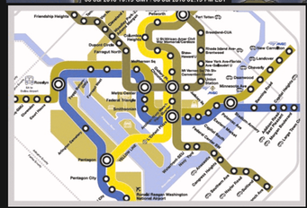
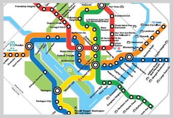
Here is the Washington, DC subway map. Can you tell the difference, at a glance, between the red and green lines on the red/green color blindness map? What about the orange line and the greenway that goes behind it? People who live with this spectrum have learned to pick up on very subtle differences to make the distinctions that many designers and information architects take for granted. But some changes in tone and intensity could easily make this map more readable for that 8%.
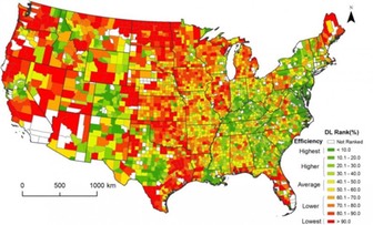
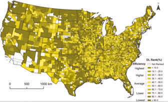
In this map, the highs and lows look very similar in red/green color blindness. This is a GREAT map, (found at Science Daily) with useful environmental information from SUNY ESF. It just needs a slightly different color scheme to be readable by everyone.
When we talk about designing for Section 508 compliance, we’re talking about making sure that people across a range of abilities have access to the data they need to make decisions, do their jobs, and find their way around. Color blindness affects a huge percentage of the population - 4.5% of your potential users, or 280 million people in the world. This is higher than almost any other ability that might find use of your site or software challenging.
There are great sites for making sure that you are respecting this population:
http://colorfilter.wickline.org is how I rendered the images shown here.
http://www.vischeck.com has always been my favorite for checking this information, but their web-based checker is currently unavailable. They do have a photoshop plugin to make it as easy as possible for designers.
There is now assistive technology for color blindness. Enchroma now makes glasses that provide a more full-spectrum experience. If you want to give yourself a spiritual gift, all you full-spectrum seeing designers, go to their YouTube channel and watch the videos of people seeing color for the first time. Then revel in your color vision, the spectrum at your disposal, and the beauty you can see. Just remember these folks when you’re doing your designs.